In 2023 I had the honor of working with my fellow students at The College of Southern Nevada in designing the 2023 Addy Magazine for the Las Vegas chapter of the America Advertising Federation (AAF). Coming up with the theme for the magazine under the prompt of "Las Vegas Neon Future" it was right up my alley.
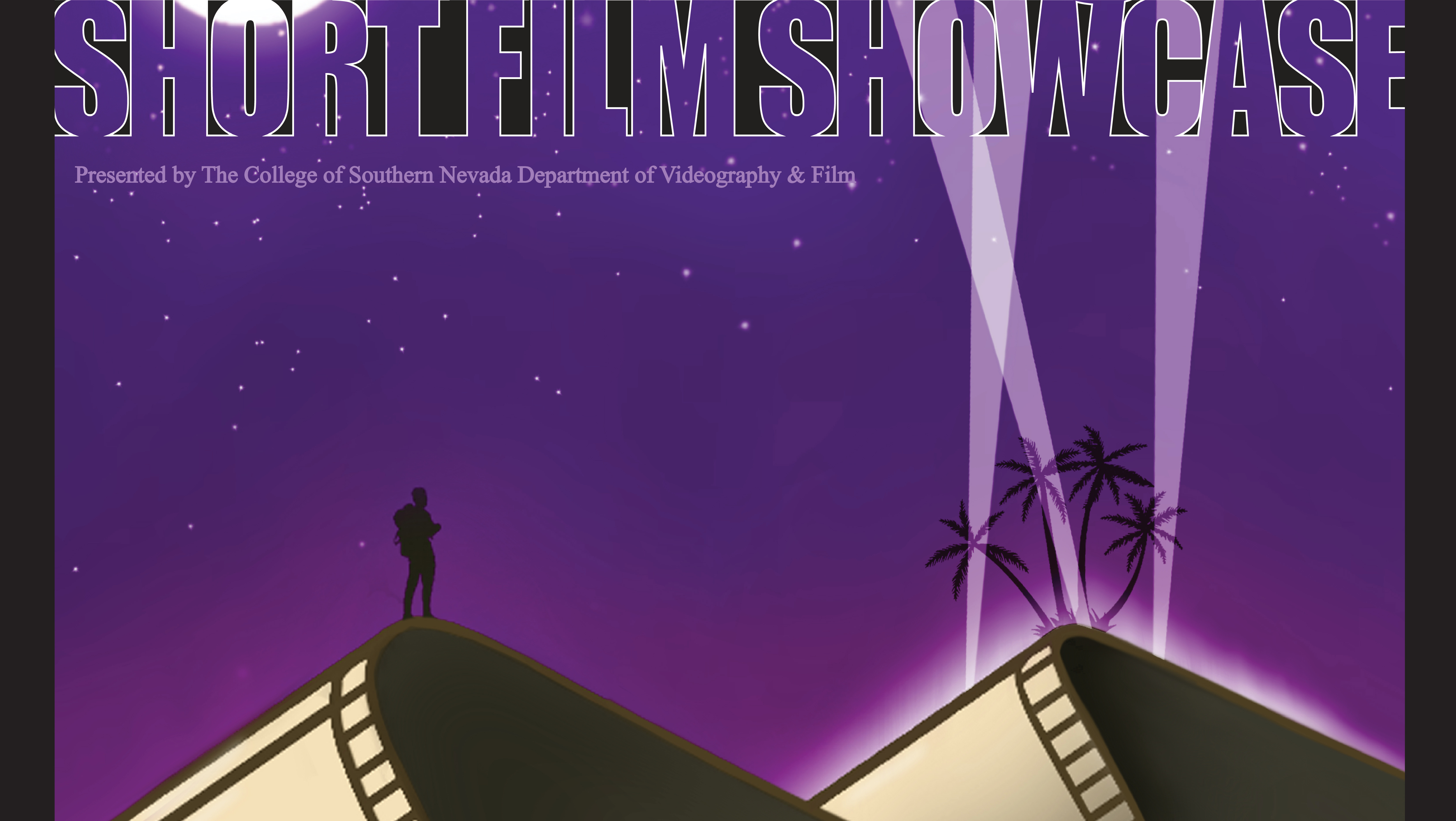
The Cover
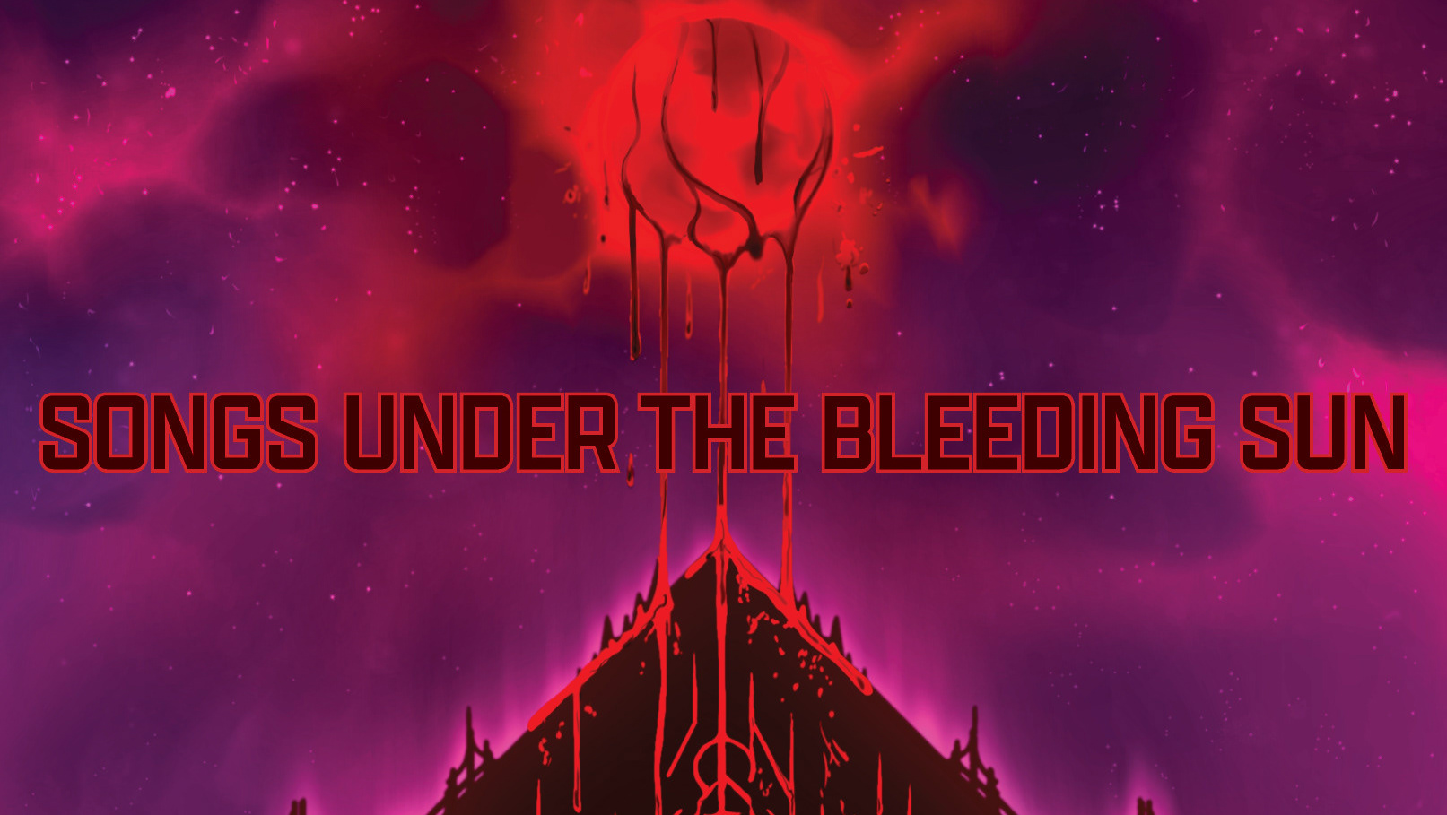
Designed by the AAF it was my launching point to come up with the theming. A striking and colorful design was needed to express the amazingly colorful submissions featured throughout.
The Table of Contents
Designed with the cover's design elements in mind, I went with the idea of the images and assets unbound by the boxes, working them into a complex and detailed landscape. With a similar vaporwave theme this work is used throughout the theming to help fill in space and give a fun dynamic to the various pages.
Letter From the Editor
The page required a simple layout given the text needed to be the focus. Thus, I used the background imagery of the cover which gave it a fun sense of color and variety that played off the use of bright-blue text. I created a simple boarder that resembled that of the four buildings included in the Las Vegas skyline with the AAF logo within it, tying in the over all theme and brand of the first set of pages.
The AFF Board Members
With a vast amount of profile pictures, the layout required a simple build with a fun concept. Given the theme of Las Vegas I went with playing cards for the frames. Each of them containing the first and last name of the person with the letter of the first name acting as the name of the suit. The suits were decided based on the positions provided by the client, going back and forth with Spades, Diamonds, Clubs, and Hearts. Each one contrasts the other to make them all stand out as you scan the page with their names even done in a contrast color to replicate the same effect.
Meet The Judges
Going back to the varying pages to keep reader interest, we move back to the full scene to fill out the two pages set aside for this section. With the judges' bios displayed below, they give insight into their experience and insight with graphic design as well as various accolades they have secured in their life.
Meet The Designers
Wanting to distinguish the board members from the designers I went with our profiles being depicted within poker chips. Each contrasting the other with the blue and pink theme with our attributions done in the same color as our name. It was such a pleasure to work with all of these talented designers and editors to bring this magazine to life!
Back Inner Cover thanks And Congratulations

